Safari 26 Liquid Glass: toolbar tinting, white bars, viewport bugs
Fix iOS 26 Safari Liquid Glass toolbar tinting, viewport-fit=cover gaps, fixed overlay bugs, and fullscreen media bars.
Safari 26 no longer reads
theme-color. It reads your CSS - and it’s pickier than you’d expect.
The fix for coding agents
Paste this into Codex, Claude Code, Cursor, or any other coding agent when you need to fix the iOS 26 Safari Liquid Glass toolbar issue:
You are fixing an iOS 26 Safari Liquid Glass viewport bug.

Symptoms:
- white, black, or weird tinted area behind the bottom Safari search bar / tab bar
- unwanted color behind the top status bar
- fixed or sticky headers tint Safari chrome
- modal backdrops leave a gap near the Safari toolbar
- viewport-fit=cover or 100dvh alone did not fix it

Do this:
1. Add viewport-fit=cover:
   <meta name="viewport" content="width=device-width, initial-scale=1, viewport-fit=cover" />

2. Set an explicit sampled root color on html and body. Do not rely on theme-color.
   Safari 26 ignores theme-color for Liquid Glass toolbar tinting.

3. Do not leave html/body transparent. Transparent root backgrounds can fall back to white.

4. At scrollY = 0, do not expect a root background-image or video to tint the top status area.
   Safari often samples CSS background-color there, not your visible media.

5. Avoid body { overflow: hidden } for fullscreen web apps.
   Keep the document scrollable enough for Safari's viewport/chrome compositor, and block gestures inside the app shell instead.

6. For fullscreen media, create a top scroll offset/runway and scroll to it on load.
   The margin and scroll cancel visually, but Safari now has non-zero scroll and can composite real pixels behind the top status area.

7. Fixed or sticky elements near the top/bottom must not have background-color or backdrop-filter on the fixed/sticky element itself.
   Put the visual glass/background on an absolute child.

8. Hidden fixed overlays must use display: none when closed.
   opacity: 0 and pointer-events: none can still tint Safari's toolbar.

9. For fullscreen image/video pages, bleed the media layer above and below the visual viewport so Safari's chrome sees real content.
   Move controls back inward with safe-area and toolbar padding.

10. Test on real iOS 26 Safari in both bottom-toolbar states.Minimal CSS shape:
:root {
  --safari-chrome-bg: #a8aca0;
  --safari-top-bleed: 62px;
  --safari-bottom-bleed: 136px;
  --safari-scroll-offset: var(--safari-top-bleed);
}

html {
  min-height: 100%;
  overflow-y: scroll;
  overscroll-behavior: none;
  background-color: var(--safari-chrome-bg);
}

body {
  min-height: calc(100dvh + var(--safari-scroll-offset));
  margin: 0;
  background-color: var(--safari-chrome-bg);
}

.app {
  height: 100dvh;
  margin-top: var(--safari-scroll-offset);
  overflow: hidden;
}

.stage {
  height: calc(100dvh + var(--safari-top-bleed) + var(--safari-bottom-bleed));
  margin-top: calc(-1 * var(--safari-top-bleed));
}

.stage > img,
.stage > video {
  width: 100%;
  height: 100%;
  object-fit: cover;
}

.controls {
  bottom: calc(env(safe-area-inset-bottom, 0px) + var(--safari-bottom-bleed) + 18px);
}Run this once on mobile Safari after layout mounts:
const offset = Number.parseFloat(
  getComputedStyle(document.documentElement)
    .getPropertyValue('--safari-scroll-offset')
) || 0;

if (matchMedia('(max-width: 760px)').matches && scrollY < offset) {
  scrollTo({ top: offset, left: 0, behavior: 'instant' });
}That covers the common searches: Safari iOS 26 viewport transparency behind the URL bar, transparency at the bottom where the navigation bar sits, iOS 26 Safari Liquid Glass toolbar tinting, weird white section behind the iOS 26 search bar, Safari 26 floating toolbar bugs, modal backdrop gaps, fixed/sticky elements changing the tab bar color, viewport-fit=cover not working, 100dvh address bar glitches, and theme-color being ignored.
With Liquid Glass, Apple redesigned every toolbar and status bar to be translucent. Safari’s browser chrome now derives its tint from the web page itself. If your fixed header has a background color, your status bar will match it. If a hidden modal backdrop sits at the bottom of the viewport, your bottom toolbar will turn dark.
No documentation from Apple explains the exact rules. Here’s what I’ve found through trial and error while building 1ar.io.
The tinting algorithm
Safari 26 scans for position: fixed or position: sticky elements near the viewport edges and reads two properties:
background-coloron the element itselfbackdrop-filteron the element itself
It uses these to compute the tint color for the nearest toolbar (status bar at the top, Safari toolbar at the bottom).
What Safari does NOT sample
position: absolutechildren of fixed elements - ignored entirely- Pseudo-elements (
::before,::after) - invisible to the tinting algorithm theme-colormeta tag - Safari 26 ignores it completely. It was the old mechanism; now tinting is purely CSS-derived- Root background images and video - useful for the visible page, but not reliable as toolbar tint input
- Non-fixed elements - regular flow content, even if visually near the edge, doesn’t affect tinting
What Safari DOES sample (even when you don’t expect it)
opacity: 0elements - a fixed element withopacity: 0still has itsbackground-colorandbackdrop-filterparsed. Invisible doesn’t mean ignoredpointer-events: noneelements - same as above. The element exists in the render tree, Safari reads its styles- Elements inside fixed parents that themselves have
position: fixed- if a child inside your fixed header is alsoposition: fixed, Safari evaluates it independently
This means hidden overlay backdrops, modal containers, and dropdown panels - the kind that sit in the DOM with zero opacity and disabled pointer events until toggled - will affect toolbar tinting unless you use display: none.
Fixing the top bar (status bar)
The status bar tints based on fixed elements within ~4px of the viewport top. A typical glassmorphism header breaks this immediately:
<!-- broken: Safari tints status bar with header's bg + blur -->
<header style="position: fixed; top: 0;
  background-color: rgba(255,255,255,0.8);
  backdrop-filter: blur(12px);">
</header>The fix: transparent parent, absolute child
Move all visual properties to a position: absolute child. Safari sees the fixed parent as transparent and ignores the absolute child.
<header style="position: fixed; top: 0;
  background-color: transparent;">
  <!-- Safari ignores this because it's position:absolute -->
  <div style="position: absolute; inset: 0;
    background-color: rgba(255,255,255,0.8);
    backdrop-filter: blur(12px);"
    aria-hidden="true">
  </div>
  <!-- nav content, z-index above the glass -->
  <nav style="position: relative; z-index: 1;">...</nav>
</header>The header stays transparent - no background-color, no backdrop-filter on the fixed element itself. The glass effect lives on a child div that Safari’s tinting algorithm skips.
Fixing the bottom bar (Safari toolbar)
The bottom bar follows the same logic but with an extra requirement: viewport-fit=cover.
<meta name="viewport" content="width=device-width, initial-scale=1, viewport-fit=cover" />Without viewport-fit=cover, the page content stops at the safe area boundary. Safari renders a solid bar in the gap between your content and the toolbar. With viewport-fit=cover, content extends behind the toolbar, giving Liquid Glass something to show through.
You also want the html element to declare its background explicitly:
html {
  background-color: var(--your-page-bg);
}Safari falls back to the html or body background when no qualifying fixed element is found near the bottom. If you don’t set it, the fallback is white (light) or black (dark) - which looks like a solid bar.
Do not set html or body to transparent and hope Safari will show more Liquid Glass. On iOS 26, transparent root backgrounds often fall back to white. If your root background is black, you get black bars. If your root background is white, you get white bars.
Hidden fixed elements break the bottom bar
This is the subtle one. If you have a modal backdrop like this:
.modal-backdrop {
  position: fixed;
  inset: 0;
  background: rgba(0, 0, 0, 0.4);
  backdrop-filter: blur(2px);
  opacity: 0;
  pointer-events: none;
}It spans the entire viewport including the bottom edge. Safari reads its background-color and backdrop-filter - even at opacity: 0 - and tints the bottom toolbar dark.
The fix: display none when hidden
.modal-backdrop {
  display: none; /* completely removed from render tree */
  position: fixed;
  inset: 0;
  background: rgba(0, 0, 0, 0.4);
  backdrop-filter: blur(2px);
}

.modal-backdrop.is-open {
  display: block;
  opacity: 1;
}When the element uses display: none, it doesn’t exist in the render tree. Safari can’t sample it. Toggle to display: block when you need it, and Safari will tint the toolbar accordingly (which is correct - when a modal is open, you want the toolbar to reflect the overlay).
If you need an opacity transition, set display: block first via JavaScript, then add the opacity class in the next animation frame:
function openModal() {
  backdrop.style.display = 'block';
  requestAnimationFrame(() => {
    backdrop.classList.add('is-open');
  });
}

function closeModal() {
  backdrop.classList.remove('is-open');
  setTimeout(() => {
    backdrop.style.display = 'none';
  }, 200); // match CSS transition duration
}Fullscreen image and video pages
This is the annoying case: game menus, launch pages, cinema pages, fullscreen videos, or anything where the whole viewport is one moving visual.
viewport-fit=cover is necessary, but it doesn’t mean Safari will put your DOM behind every piece of native chrome. The top status area has 2 states that matter:
- At
scrollY = 0, Safari often uses the sampled or fallback root color. - After the document has non-zero scroll, Safari can composite real page pixels behind the top status area.
So the root background-color is still important, but it is a fallback. For fullscreen media, the better fix is a scroll runway: make the document slightly taller, put the app after a top offset, then auto-scroll to that offset. The margin and the scroll cancel visually. Safari gets a non-zero scroll state, and the user sees the same first frame.
The practical fix is three-part:
- Pick a root
background-colorthat matches the current scene well enough as fallback. - Add a small top scroll runway and scroll to it on load.
- Bleed the fullscreen media layer above and below the visual viewport so Safari samples actual content.
:root {
  --safari-chrome-bg: #a8aca0;
  --safari-top-bleed: 62px;
  --safari-bottom-bleed: 136px;
  --safari-scroll-offset: var(--safari-top-bleed);
}

html {
  min-height: 100%;
  overflow-y: scroll;
  overscroll-behavior: none;
  background-color: var(--safari-chrome-bg);
}

body {
  min-height: calc(100dvh + var(--safari-scroll-offset));
  margin: 0;
  background-color: var(--safari-chrome-bg);
}

.fullscreen-app {
  height: 100dvh;
  margin-top: var(--safari-scroll-offset);
  overflow: hidden;
}

.media-stage {
  height: calc(100dvh + var(--safari-top-bleed) + var(--safari-bottom-bleed));
  margin-top: calc(0px - var(--safari-top-bleed));
}

.media-stage > img,
.media-stage > video {
  width: 100%;
  height: 100%;
  object-fit: cover;
}

.hud {
  padding-top: calc(env(safe-area-inset-top, 0px) + var(--safari-top-bleed));
  padding-bottom: calc(env(safe-area-inset-bottom, 0px) + var(--safari-bottom-bleed));
}Then scroll to the runway offset:
const offset = Number.parseFloat(
  getComputedStyle(document.documentElement)
    .getPropertyValue('--safari-scroll-offset')
) || 0;

if (matchMedia('(max-width: 760px)').matches && scrollY < offset) {
  scrollTo({ top: offset, left: 0, behavior: 'instant' });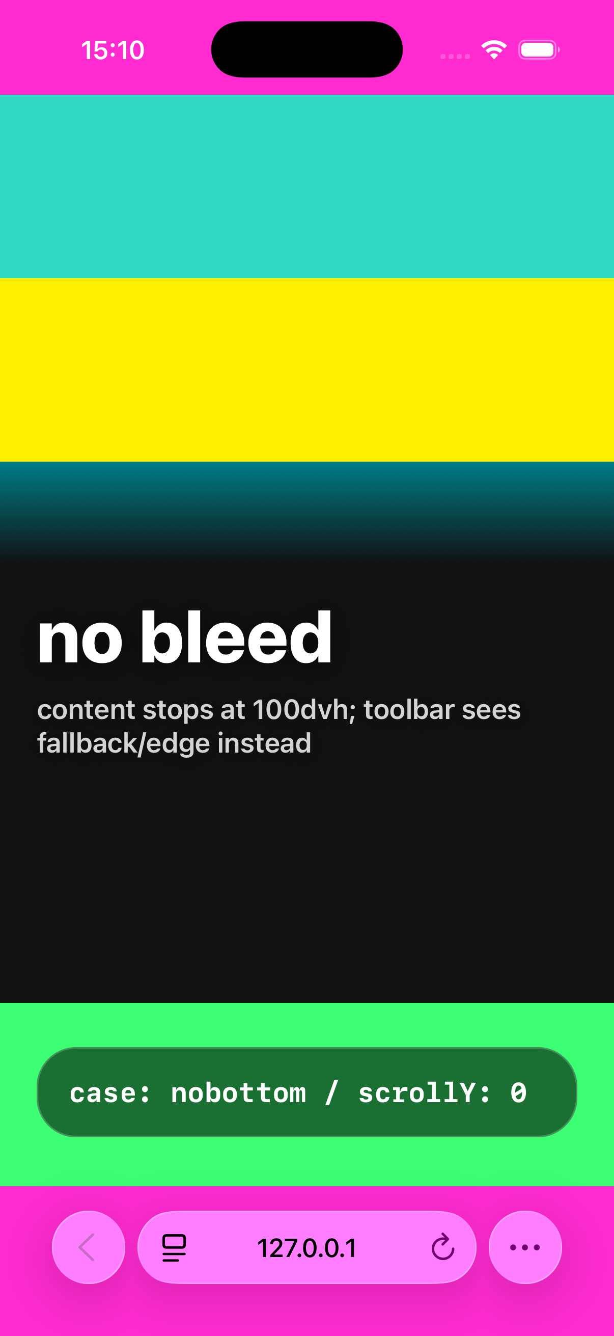
}Those bleed numbers are not magic. They are guard bands for Safari’s expanded toolbar state. Tune them against your layout, then test on a device. The important part is the shape: the visible app remains 100dvh, the media extends beyond it, controls move back inside the usable area, and mobile Safari starts at a small non-zero scroll offset.
One more trap: body { overflow: hidden } often makes this worse. Use height: 100dvh and overflow: hidden on your app shell, but let html remain scrollable. If you need to block page movement, block the gesture inside the shell, carousel, or menu. Do not lock the whole document unless you have tested the Safari chrome states.
Tested variants: fixed/background image at scrollY = 0 still showed color fallback in the cases that broke fullscreen media pages; absolute/flow media with non-zero scroll showed real pixels behind top and bottom Safari chrome.
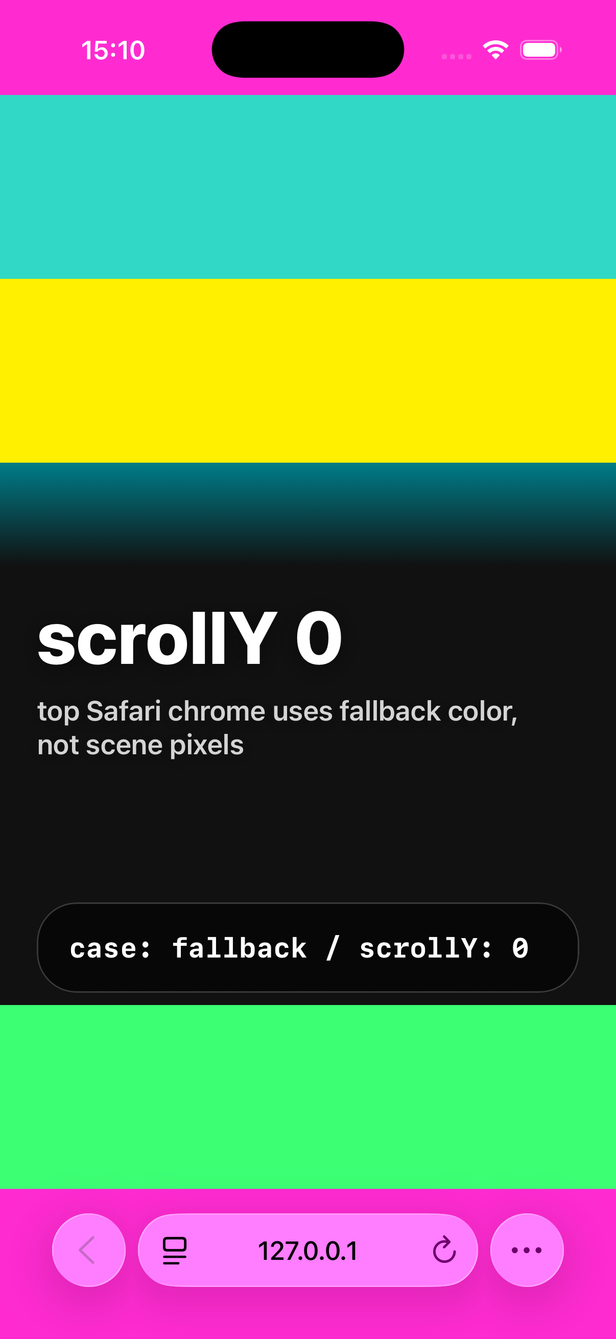
scrollY = 0, the top Safari status area can show the fallback root color instead of the visible page pixels.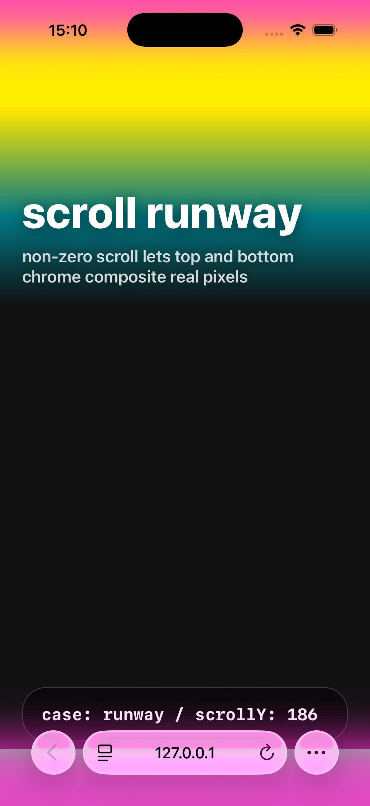
100dvh and the toolbar can expose fallback color or the page edge.Quick checklist
- Viewport meta: add
viewport-fit=cover- required for bottom bar transparency - HTML/body background: set an explicit sampled color - Safari uses it as fallback
- Fixed header: transparent background, no backdrop-filter on the fixed element itself. Glass effect on an absolute child
- Hidden overlays: use
display: nonewhen inactive, not justopacity: 0 - Theme color: still fine to set for older browsers, but Safari 26 ignores it
- Layout padding: account for safe area insets since
viewport-fit=coverextends content into safe areas - Fullscreen media: keep root color fallback, bleed media above/below the viewport, and start mobile Safari at a small non-zero scroll offset
- Body lock: avoid
body { overflow: hidden }unless device testing proves it is safe
Known issues
Safari’s tinting behavior with fixed elements has been filed as WebKit Bug #302272 (duplicate of #300965). Safari 26.2 fixed fullscreen dialog backdrops not extending below the address bar, but the general fixed-element tinting behavior appears to be by design rather than a bug - it’s how Liquid Glass is supposed to work. Web developers just need to account for it.
Ben Frain has a detailed write-up on the same issue, focused on dialog and popover elements.
The iOS keyboard gap: another layer of nonsense
Here’s one Apple didn’t bother telling anyone about.
When the software keyboard is open on iOS 26, there’s a native keyboard accessory bar - the strip with ^ v ✓ buttons that sits between your web content and the keyboard. This bar renders a slice of your web page outside your overlay’s compositing context. Your backdrop filter? Doesn’t reach it. Your fixed overlay? Doesn’t cover it. The keyboard accessory bar does its own thing.
The result: if you have a command palette or search overlay open, the area between your input field and the keyboard shows raw page content. Sharp, unblurred, fully readable text peeking through - while the rest of your carefully crafted overlay dims everything else.
No CSS property controls this. No backdrop-filter reaches it. No opacity or z-index tricks help. It’s native UI rendering a snapshot of your web view from a compositing layer you cannot access.
The fix: blur the actual content
Instead of trying to blur through the overlay (backdrop-filter on a fixed element), blur the source content itself:
function openOverlay() {
  const main = document.querySelector('.layout-main');
  const footer = document.querySelector('footer');
  if (main) main.style.filter = 'blur(8px)';
  if (footer) footer.style.filter = 'blur(8px)';
}

function closeOverlay() {
  const main = document.querySelector('.layout-main');
  const footer = document.querySelector('footer');
  if (main) main.style.filter = '';
  if (footer) footer.style.filter = '';
}This works because filter: blur() modifies the rendered DOM content at the source. When the keyboard accessory bar grabs its slice of the web view, it gets the blurred version. The gap between your input field and the keyboard now shows blurred content instead of readable text.
What doesn’t work (I tried all of these)
- Body background color - the gap shows rendered DOM elements, not the body background. Setting it to dark changes nothing visible in the gap.
- Transparent html background - hoping Safari would fall back to Liquid Glass for the top bar. Instead it falls back to white. Thanks.
- Root background image only - the image can cover your page, but Safari’s top status area still wants a sampled color.
100dvhalone - it fixes app sizing. It does not fix toolbar tinting, hidden fixed overlays, or Safari’s native chrome sampling.viewport-fit=coveralone - required, but not enough if your root background, fixed elements, or body lock are wrong.- Brightness filter -
brightness(0.5)doesn’t carry through to the keyboard accessory bar’s rendering. The blur does, brightness doesn’t. No explanation why. - Opacity -
opacity: 0.4kills the blur effect entirely when combined withfilter: blur(). Two CSS properties that should compose, but don’t. - Dark background on content elements - affects the visible content through the overlay (making it too dark), but doesn’t affect the keyboard gap area. The gap shows its own rendering.
What partially works
You can darken the footer’s background to make the bottom gap darker, but you can’t match the overlay’s exact dimming level - the footer is visible both through the overlay (where it compounds) and in the gap (where it doesn’t). You’d need different opacity in two places, and you only have one element.
On Apple’s documentation
There is no Apple documentation for any of this. Not the tinting algorithm. Not the sampling rules. Not the keyboard accessory bar compositing behavior. Not even a mention that theme-color is now ignored.
The WebKit blog posts announce features. The WWDC sessions demo Liquid Glass on native apps. The web gets a blog post about new CSS properties and a pat on the head.
Everything in this article was found through trial and error while building 1ar.io. The tinting sampling rules (4px from top, 3px from bottom, 80% viewport width) come from community reverse-engineering. The keyboard accessory bar behavior came from hours of testing on a real device because the simulator doesn’t reproduce half of these issues.
Apple shipped a design system that fundamentally changes how web pages render in their browser, published zero documentation for web developers, and left the community to figure it out through console.log and screenshots. The one relevant WebKit bug got closed as “by design.”
Liquid Glass is beautiful on native apps where Apple controls every layer. On the web, it’s a minefield of undocumented compositing behaviors, native UI layers that ignore your CSS, and a tinting algorithm that reads properties from elements you thought were hidden. Every fix is a workaround. Every workaround breaks something else. The only thing Safari is consistent about is being inconsistent.
Updated checklist
- Viewport meta:
viewport-fit=cover- required for bottom bar transparency htmlandbodybackground: set an explicit sampled color - Safari uses it as fallback- Fixed header: transparent background, no backdrop-filter on the fixed element itself. Glass effect on an absolute child
- Hidden overlays: use
display: nonewhen inactive, not justopacity: 0 - Content blur for overlays: apply
filter: blur()to main content and footer when an overlay is open - the only way to blur the keyboard accessory bar gap on iOS - Theme color: still fine to set for older browsers, but Safari 26 ignores it
- Layout padding: account for safe area insets since
viewport-fit=coverextends content into safe areas - Fullscreen media: keep root color fallback, bleed media above/below the viewport, and start mobile Safari at a small non-zero scroll offset
- Body lock: avoid
body { overflow: hidden }for app shells unless real-device Safari testing says it is fine
Further reading
- How Liquid Glass works - displacement maps, 2D refraction, and gyroscope tricks
- andesco/safari-color-tinting - community-built test suite for Safari tinting behavior
- Ben Frain on iOS 26 tinting -
dialogandpopoverelement tinting issues - Edoardo Lunardi on fixed overlays - the
opacity: 0.99compositing hack - Mike Piontek on Safari 26 - “Safari 26 and Liquid Glass have little respect for web sites”
- What’s new in Safari and WebKit - WWDC25 - official session (doesn’t cover tinting)
- WebKit features in Safari 26.0 - release notes